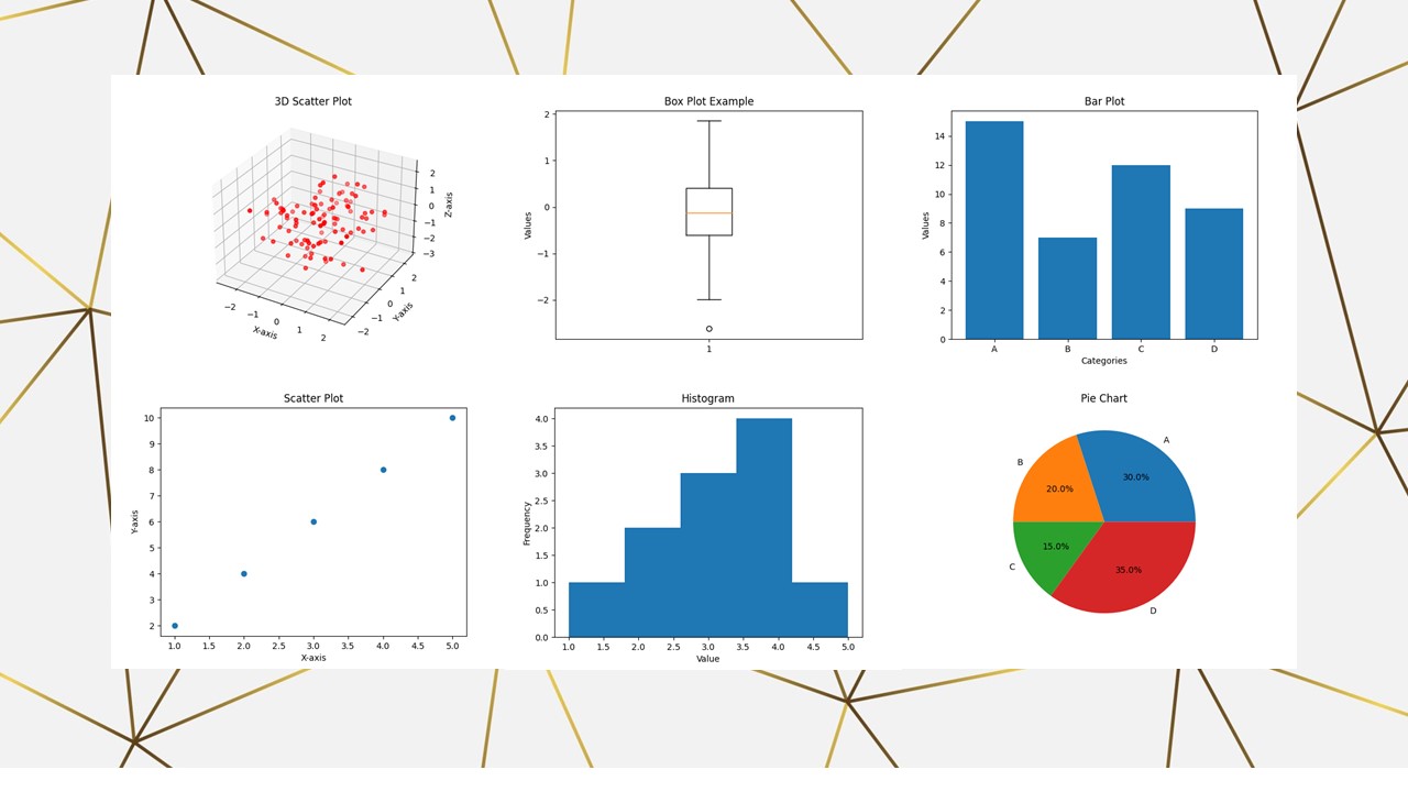
Data visualization plays a crucial role in data analysis and exploration. It helps us gain insights from complex datasets and communicate information effectively. In Python, Matplotlib is a powerful library widely used for creating visually appealing and informative plots. In this blog post, we will delve into the world of data visualization with Matplotlib and explore various techniques and examples to create stunning visualizations.
Table of Contents:
- Installing Matplotlib
- Line Plot
- Scatter Plots
- Bar Plots
- Histograms
- Pie Charts
- Box Plots
- Heatmaps
- 3D Plots
- Subplots
- Customizing Plots
- Saving Plots
Installing Matplotlib
Before we dive into the examples, let’s start by installing Matplotlib and setting it up in our Python environment. We will explore different installation methods and ensure that Matplotlib is properly configured. You can install Matplotlib using pip or conda, depending on your Python distribution. Once installed, you can import it into your Python script using the import matplotlib.pyplot as plt statement.
Line Plot
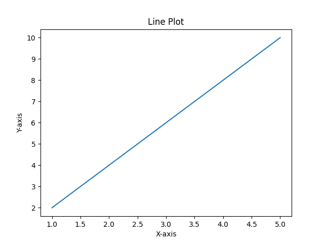
A line plot is a basic chart that displays data points connected by straight lines. It is suitable for showing trends over time or sequential data. To create a line plot, we need two arrays: one for the x-axis values and another for the corresponding y-axis values. We can then use the plot function to generate the line plot. Example code:
import matplotlib.pyplot as plt

x = [1, 2, 3, 4, 5]
y = [2, 4, 6, 8, 10]

plt.plot(x, y)
plt.xlabel('X-axis')
plt.ylabel('Y-axis')
plt.title('Line Plot')
plt.show()
Scatter Plots
A scatter plot displays individual data points as dots, allowing us to observe the relationship between two continuous variables. Scatter plots are created using the scatter function in Matplotlib. Example code:
import matplotlib.pyplot as plt

x = [1, 2, 3, 4, 5]
y = [2, 4, 6, 8, 10]

plt.scatter(x, y)
plt.xlabel('X-axis')
plt.ylabel('Y-axis')
plt.title('Scatter Plot')
plt.show()

Bar Plots
Bar plots are useful for comparing categorical data. They represent the data using rectangular bars, where the length of each bar corresponds to the magnitude of the data. We can create bar plots using the bar function in Matplotlib. Example code:
import matplotlib.pyplot as plt

categories = ['A', 'B', 'C', 'D']
values = [15, 7, 12, 9]

plt.bar(categories, values)
plt.xlabel('Categories')
plt.ylabel('Values')
plt.title('Bar Plot')
plt.show()

Histograms
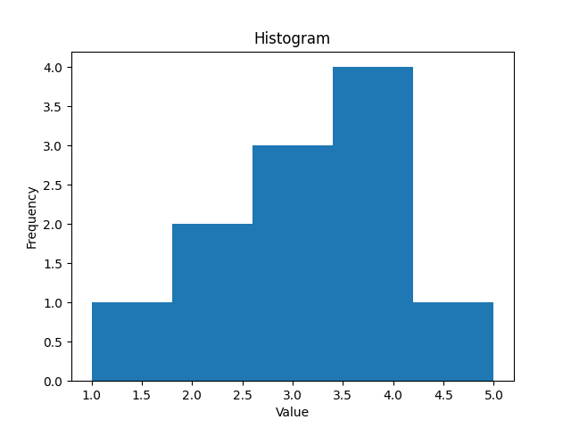
Histograms are used to represent the distribution of a continuous variable. They group the data into bins and display the frequency or count of data points falling into each bin. We can create histograms using the hist function in Matplotlib. Example code:
import matplotlib.pyplot as plt

data = [1, 2, 2, 3, 3, 3, 4, 4, 4, 4, 5]

plt.hist(data, bins=5)
plt.xlabel('Value')
plt.ylabel('Frequency')
plt.title('Histogram')
plt.show()
Pie Charts
Pie charts are useful for displaying proportions or percentages of different categories. They represent each category as a slice of a pie, with the size of each slice corresponding to its proportion. We can create pie charts using the pie function in Matplotlib. Example code:
import matplotlib.pyplot as plt

sizes = [30, 20, 15, 35]
labels = ['A', 'B', 'C', 'D']

plt.pie(sizes, labels=labels, autopct='%1.1f%%')
plt.title('Pie Chart')
plt.show()

Box Plots
Box plots provide a visual summary of the distribution of a dataset. We will explore how to create box plots using Matplotlib and interpret the key components of the plot, such as whiskers, medians, and outliers.
import matplotlib.pyplot as plt
import numpy as np

# Generate random data for demonstration
np.random.seed(42)
data = np.random.normal(0, 1, size=(100,))

# Create a figure and axes
fig, ax = plt.subplots()

# Create the box plot
ax.boxplot(data)

# Customize the plot
ax.set_title("Box Plot Example")
ax.set_ylabel("Values")

# Show the plot
plt.show()

Heatmaps
Heatmaps are effective for visualizing matrices or 2D datasets. We will learn how to create heatmaps using Matplotlib and customize color maps, annotations, and axis labels.
import numpy as np
import matplotlib.pyplot as plt

# Generate some random data
data = np.random.rand(5, 5)

# Create a figure and axis objects
fig, ax = plt.subplots()

# Create the heatmap
heatmap = ax.imshow(data, cmap='hot')

# Add colorbar
cbar = plt.colorbar(heatmap)

# Set the tick labels
ax.set_xticks(np.arange(data.shape[1]))
ax.set_yticks(np.arange(data.shape[0]))
ax.set_xticklabels(['A', 'B', 'C', 'D', 'E'])
ax.set_yticklabels(['1', '2', '3', '4', '5'])

# Rotate the tick labels and set their alignment
plt.setp(ax.get_xticklabels(), rotation=45, ha="right", rotation_mode="anchor")

# Set the title and labels
ax.set_title("Heatmap Example")
ax.set_xlabel("X-axis")
ax.set_ylabel("Y-axis")

# Show the plot
plt.show()

3D Plots
In this section, we will venture into the world of 3D plotting using Matplotlib. We will explore how to create 3D line plots, surface plots, and scatter plots, enabling us to visualize complex data in three dimensions.
import numpy as np
import matplotlib.pyplot as plt
from mpl_toolkits.mplot3d import Axes3D

# Generate some random data
np.random.seed(0)
n = 100
x = np.random.randn(n)
y = np.random.randn(n)
z = np.random.randn(n)

# Create a figure and axis objects
fig = plt.figure()
ax = fig.add_subplot(111, projection='3d')

# Create the 3D scatter plot
ax.scatter(x, y, z, c='r', marker='o')

# Set the labels for each axis
ax.set_xlabel('X-axis')
ax.set_ylabel('Y-axis')
ax.set_zlabel('Z-axis')

# Set the title
ax.set_title('3D Scatter Plot')

# Show the plot
plt.show()

Subplots
Subplots allow us to create multiple plots within a single figure. We will learn how to create subplots using Matplotlib and organize them in various layouts to present multiple visualizations side by side.
import numpy as np
import matplotlib.pyplot as plt

# Generate some random data
x = np.linspace(0, 2 * np.pi, 100)
y1 = np.sin(x)
y2 = np.cos(x)

# Create a figure and axis objects for subplots
fig, axes = plt.subplots(nrows=2, ncols=1, figsize=(8, 6))

# Plot the data on the first subplot
axes[0].plot(x, y1, color='blue', label='Sin(x)')
axes[0].set_xlabel('x')
axes[0].set_ylabel('sin(x)')
axes[0].set_title('Sine Function')

# Plot the data on the second subplot
axes[1].plot(x, y2, color='red', label='Cos(x)')
axes[1].set_xlabel('x')
axes[1].set_ylabel('cos(x)')
axes[1].set_title('Cosine Function')

# Adjust the spacing between subplots
plt.tight_layout()

# Show the plot
plt.show()

Customizing Plots
We can customize various elements of our plots, including colors, markers, line styles, axes, and grids. A detailed post on customizing plots in my previous post – Python Matplotlib Customizing Plots
Saving Plots
Once we have created our visualizations, we need to know how to save them for future use. We will explore how to save plots in different formats, such as PNG, PDF, or SVG, using Matplotlib.
Conclusion:
Data visualization is an indispensable tool for understanding and communicating insights from data. In this blog post, we embarked on a journey into data visualization with Matplotlib in Python. We covered various plot types, customization options, and techniques to create captivating and informative visualizations. Armed with the knowledge gained here, you can now explore Matplotlib further and unleash its power to visualize and analyze your own datasets effectively. Happy plotting!
 Information Sharing Blog
Leave a comment